
This poster showcases the principle of rhythem. The repition of the dancer's arms are made to look like the swan's feathers.
 This graphic poster represents contrast using complementary colors blue and orange.
 This poster has the principle of unity, because there are no lines or shapes that are following in a visual line.
 In this poster, dirrection is shown with the shoelaces; showing all angles of the laces.
 Stephen Kroninger's piece showcases how proportion adds visual interest.
 Balence is used in this poster, because the music note is leaning to the left, but the text balences it by utilizing the negative space at the bottom right of the poster.
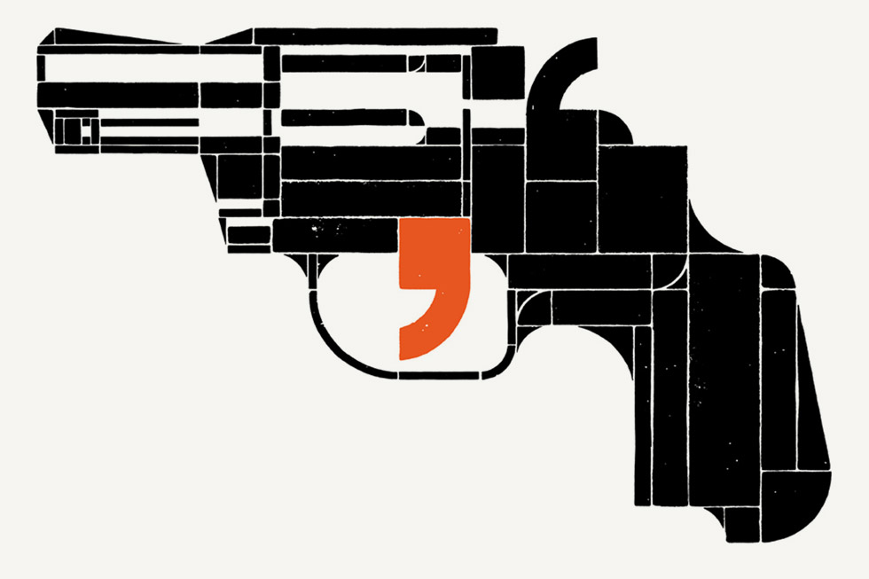 This poster is a great example of emphasis, because with only two elements integrated into this piece, it still manages to get the message across.
 This poster showcases the principle of economy. You can remove one shape or element and the audience still understands the message.
In photoshop, to add a new layer mask, you click on the button located on the layers palette that is in the shape of a rectangle with a circle in the middle.
Black and white are both used in the creating a layer mask.
To use a layer mask, you click on the layer mask button. Then, make sure the brackets are around the layer mask on the layers palette. Next, you click on the brush button located on the formatting palette and set the foreground color to black to hide parts of an image. If a part of the image is accidentally hiden, use white in the foreground color to make that part reappear.
No comments:
Post a Comment