
Friday, May 11, 2012
Monday, May 7, 2012
Research Social Issue
Shepard Fairey
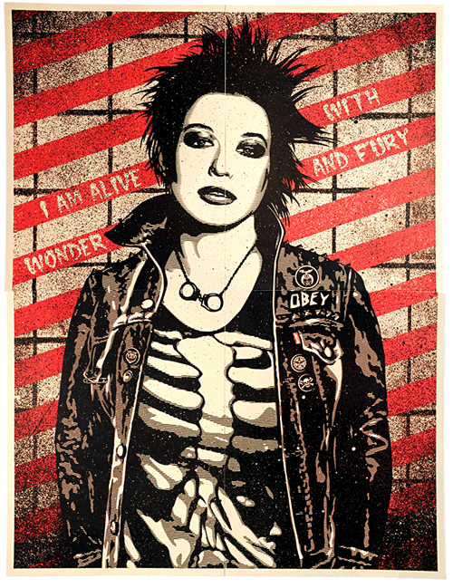


Shepard Fairey sticks to the two colors black and red to simplify the meaning while still conveying the importance and emotion of the meaning. His works pay attention to detail without being overwhelming.
- He is known for creating the Obama campaign poster, "Hope"
- He has been named one of the most influential street artists
red and blue seem to be the main colors dominating many social issue posters


Tuesday, May 1, 2012
Thursday, April 26, 2012
#19 research and inspiration


The font and the type of key, the era of it, fit perfectly. This is what I hope to create with my design. I love the vintage or off designs, and this font is probably my favorite.
This combination mark satisfies the requirements of being able to be a small mug or a huge t-shirt, it's memorable because it's so cute and fun. The chick is a simple cartoon and the font is playful including eyes in the "o" and "a."
Tuesday, April 24, 2012
Stationary Package
-the printed pieces that a company utilizes for communication purposes
-very important that all communications are organized and the message of it is well conveyed
-very important that all communications are organized and the message of it is well conveyed
- includes business card, letterhead, envelope
-business card gives a very strong first impression
-includes:
- logo
- company name
- employee name
- title
- phone number
- fax number
- email address
- company address
- web address
Design Tips
- must be 2 x 3.5
- horizontal or vertical
- check for accuracy
- check for unity...continuity among other pieces
- .25 - .125 margins-important parts
Letterhead
- a printed piece of paper used to send letters, etc.
- includes:
- logo (most prominent)
- company name
- company address
- phone number
- fax number
- web address
- in U.S. must be 8.5" x 11"
- must be vertical
- leave room for memo
- check for accuracy
- check or unity continuity among other pieces
Envelope
- the packaging that contains the letter/form when being mailed
- std. #10 envelope
- includes:
- logo
- company name
- company address
- Design Tips
- 9.5" x 4.125"
- horozontal or vertical design
- must leave room for recipient's address and stamp
- check for accuracy
- check for unity
*Very important to be consistent with each piece of company paperwork
Thursday, April 19, 2012
Assignment 18 Brainstorm


I really like this wordmark because even though it doesn't include an image next to the restaurant name, it still conveys a little bit of the restaurant's identity. Just by taking one look at it, I can tell it is an old style Italian restaurant. The columns represent Ancient Rome, and the word "ristorante" below helps solidify that it is indeed an Italian restaurant.

This wordmark is perfect, because it has the title, "Green Teams" and keeps it simple with having the word "green" in the color green. Also the font used is a variation of sans serif, so the type has clean lines.
Green has more emphasis than teams and having green be larger, in a bolder color, and closer to the left lead the viewer's eye to that word first.
Subscribe to:
Posts (Atom)